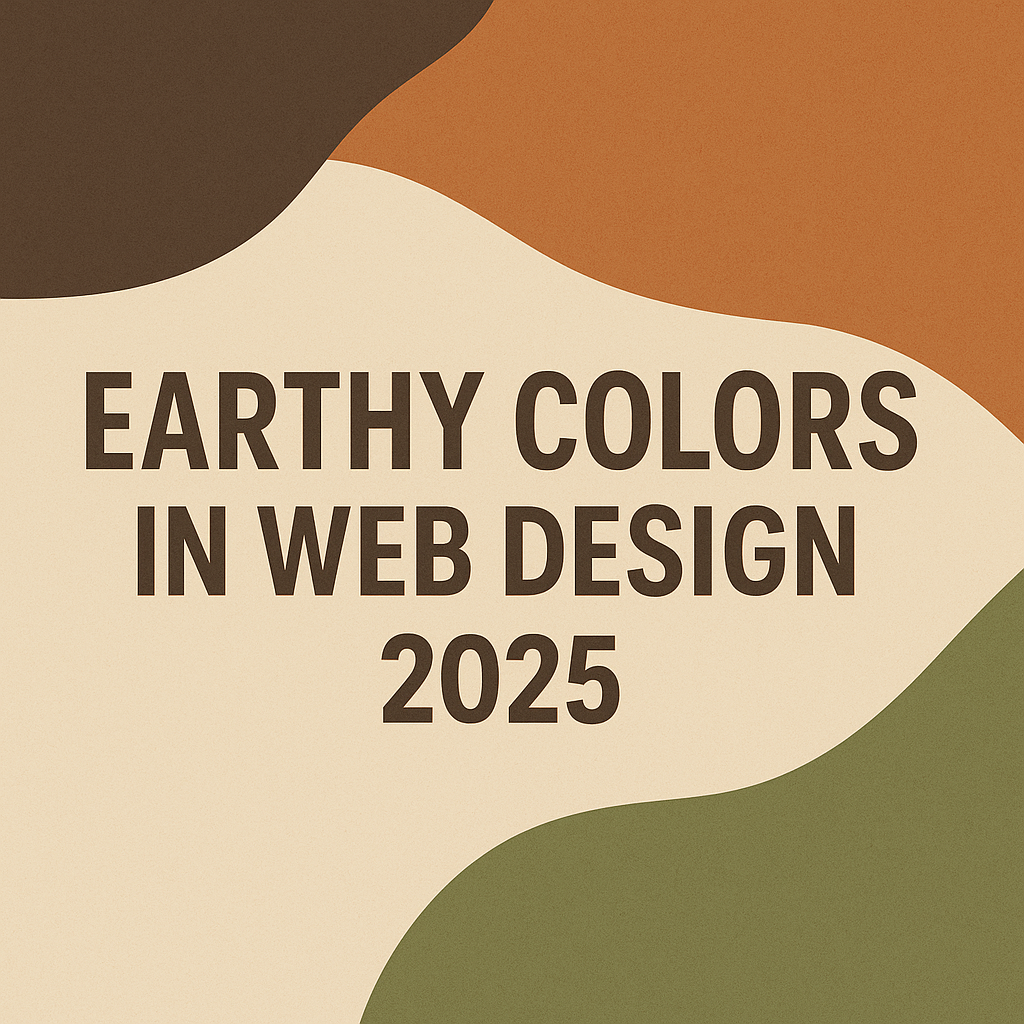
In 2025, websites are going green — and not just with sustainability. Earthy colors in web design are emerging as the go-to aesthetic for brands that want to appear natural, grounded, and real. From muted greens and warm browns to terracotta shades and sandy neutrals, this color trend is dominating modern digital spaces.
1. Users Want Authenticity
Audiences are becoming more sensitive to overused, artificial color schemes. Natural color palettes feel honest and relatable. Earthy tones connect emotionally with users without overwhelming them, helping brands build trust and authenticity at first glance.
2. Wellness and Sustainability Are Driving Design
The global focus on wellness, mental health, and sustainability has entered the design world. Earth-toned website designs reflect balance, calm, and a connection to nature. In today’s fast-paced digital environment, these tones offer a visual sigh of relief.
3. Earthy Colors Are Timeless
While trendy colors like neon pink may catch attention today, they often fade fast. Organic tones in web design, like olive green or warm beige, remain stylish year after year. Choosing timeless hues reduces the need for frequent redesigns and keeps your brand looking current longer.
4. Perfect Match for Minimalist Layouts
Minimalist web design is still king in 2025 — think clean lines, strong typography, and lots of white space. Earthy color palettes enhance these layouts by adding visual warmth and depth without distracting from content.
5. Visual Comfort = Better Engagement
Users are spending more time online than ever. Harsh colors can cause eye fatigue, while muted tones in web design are easier on the eyes. This improves user comfort, encourages longer session times, and even helps with SEO by reducing bounce rates.
In Short
Earthy colors in web design are more than just a trend — they’re a response to deeper cultural shifts around trust, wellness, and long-term sustainability. They help your website feel more human, more calming, and more future-ready.
👉 Want to see this in action?
Check out the website we built for Cross Communications Interpreting Services, which uses an elegant earth-tone palette. It’s a great example of how nature-inspired colors bring warmth and trust into digital experiences.
🪴 Ready to future-proof your website?
Let’s bring earthy tones to your design.
Leave a Reply